Quira Blog

Articles

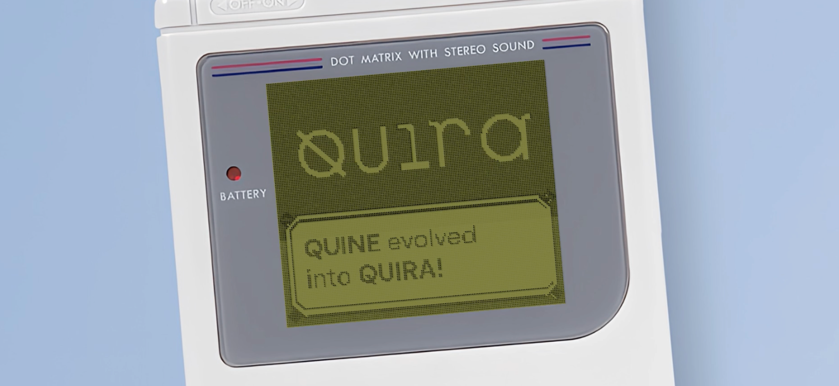
Quine has evolved into Quira

Today marks a significant milestone in our journey — we are thrilled to announce that Quine has evolved into Quira (/ˈkiːrə/ or “KEEH-rah”). The timing for this change couldn’t be more significant. Over the last few months, our company has undergone deep and significant changes in our team, product, and strategy. These developments have led us to adopt a new identity that mirrors these transformations. This week not only marks a key chapter in our history, but also reinforces our dedication to changing the way developers monetise their skills, time, and reputation. Reaffirming our commitment Our core mission remains the same: to help developers make as much money as possible form their work, time, and reputation. Echoing Stripe’s vision, we aim to maximise the GDP of software creators. Our approach to do this is and will continue to be heavily data-driven and centred around the concept of experience quantification. To reaffirm our present commitment, it’s essential to recall our origins. Our journey began years ago when we first took on the challenge of measuring developer experience from open source contributions. Little did we know, this endeavour would lead us down a rabbit hole into some unexplored territory. It turns out that quantifying experience from code is intricately linked with a number of other exciting problems, such as evaluating the significance of open-source contributions, assessing the reputation of developers, matching developers to tasks, classifying code content, among others. Even though all of these problems are interrelated, each of them represents unique challenges in terms of data, computation, and modelling. Over the past few years, we’ve focused on modelling these problems in a rigorous way. Our efforts have now come together in our Quests products, which use these models to efficiently deploy financial and reputational bounties for the beneift of our partners and our userbase. Through Quests, we have introduced two novel incentive mechanisms tailored for the open-source community. On the one hand, Creator Quests, reminiscent of a decentralised hackathon that operates 24/7, incentivises the creation of open-source content that drives user acquisition for dev-tools and OSS organisations. On the other hand, Solver Quests enables organisations to price issues in open-source projects to accelerate the speed of delivery or build community. Our Quests products are the cornerstone of achieving our mission, and we will continue to invest heavily in them. Looking ahead Exciting things are coming for Quira. We don’t want to throw all the spoilers just yet, but we’re working tirelessly to elevate Quests to entirely new levels. In the upcoming quarters, we will embrace AI, open source, and mechanism design like never before. Most importantly, we will return to our roots and tackle this next wave of challenges with curiosity, rigour, and a relentless dedication to creating value for developers and organisations. Thank you for your support and for joining us on this journey. — Rodrigo & Team Quira 🙇

Rodrigo Mendoza-Smith

By Rodrigo Mendoza-Smith

Jun 27, 2024

3 min read

The tragedy of commons in OSS

A data essay exploring symptoms, remedies, and opportunities Recently GitHub released For Good First Issue, a special index that tracks Digital Public Goods (DPGs) repos. This includes open-source software, open data, open AI system, or open content collection that supports the United Nations sustainable Development Goals (SDGs). Currently, the official registry counts ~132 projects which includes a variety of social and impact-focused projects like a webapp to track hypertensive patients across a population, an app for citizen participation and open government, and software to help social workers manage data on vulnerable children. For Good First Issue addresses a significant need in the open-source ecosystem: directing dedicated and socially conscious talent to projects that positively impact society and would otherwise struggle to attract contributors. Initiatives like this one can help raise the collective consciousness of contributors and ameliorate the negative externalities that arise from the tragedy of the commons. The tragedy of the commons In economics, the tragedy of the commons refers to the situation in which individuals with access to a public resource act in their own interest and, in doing so, ultimately deplete the resource. Though this concept is traditionally associated with shared environmental resources, it can also extend to the domain of open source software. While resources can’t be depleted in the context of software, they can be regarded as abused when users do not donate time, work, or resources to the communities they take from. In these situations one can observe a number of negative consequences like slow development, weakened community support, or even legal and licensing risks. The famous monetisation and maintainer problems in open source are nothing less than a manifestation of this economic pathology. A number of initiatives have tried to ameliorate the tragedy, but no definite solution exists yet. In light of GitHub’s recent initiative it is important to understand in what ways the tragedy of the commons manifests in open source, and whether curated contributor indices like DPGs can help break it. In particular, we investigate whether initiatives like DPG projects present a real opportunity to current or aspiring open source contributors. To do this, we compare the set of DPG projects on GitHub against three other sets of open source repos, 2,395 projects from the Apache foundation, 8,129 projects under the Linux Foundation umbrella, 6,805 projects maintained by RedHat. 1,255 repos belonging to Digital Public Goods, To perform this comparison we derive traction and engagement metrics using publicly available GitHub data. Specifically, we look at three fundamental metrics: issue backlog, contributor retention, and maintainer responsiveness. These metrics will help us understand the overall health of each group of projects, as measured by the activity metrics that most strongly correlate either with the resources available to a project or with the community’s support to the project. This will help us understand whether DPGs are particularly affected by the tragedy of the commons and the type of developer experience (DX) that new contributors can expect. #1: DPGs have (on average) less contributors per issue than other groups An important indicator of the “tragedy of the commons” in open source is the size of the of the issue backlog a project has. In other words, the number of unresolved open issues in the repository. Although not every open issue represents critical technical debt, an imbalance between issue creations and number of merged PRs suggests a lack of resources to manage them effectively. Public data shows that DPGs have the highest concentration of open issues per repository, but also the fewest number of contributors per issue. While this indicates a scarcity of contributor resources, the relative high number of open issues also suggests an opportunity for contributors who want to make a significant impact by applying their software skills to for-good projects. #2: DPGs have less long-term contributor retention than RedHat & Apache Contributor retention is important to keep a project’s issue backlog under control. To better understand contributor engagement we compute “On or After Contributor Retention” which we define as the percentage of contributors who merge a Pull Request (PR) at a specific time or any time thereafter after the first contribution. Interestingly, DPGs show the highest “On or After Contributor Retention” contributor within a three month period. However, this engagement drops significantly after month 3 and stays below the retention shown by Apache’s and RedHat’s projects. It’s worth noting that DPGs have the hightest short-term retention, but that six months after the first contribution 60% of them don’t contribute again. #3: DPG maintainers are as responsive as maintainers from RedHat and the Linux Foundation. Another strong indicator of resource scarcity in a project is the waiting time a contributor experiences after submitting a PR, specifically, the average time they wait to see their PR merged into the codebase. If a maintainer has more bandwidth, they can review and give feedback more quickly, thus decreasing the average merge time. Notably, public data shows that DPG repositories exhibit a level of maintainer responsiveness comparable to that of RedHat and the Linux Foundation and superior to that of the Apache Foundation. This indicates that the level of Developer Experience (DX) when contributing to these repos is comparable to that of more established and popular projects. Breaking the tragedy of the commons Let’s get contributing! Our analysis shows that DPG repos are rich in open issues and that in some respects (like maintainer responsiveness) one can expect a similar level of DX than repos under the RedHat or the Linux Foundation patronage. As the number of DPG projects grow, it’s important for aspiring contributors to use an index to browse for the most relevant communities. Considering that open source is the most secure model for developing AI systems for the public, we anticipate a significant growth in DPGs indices over the next few years. GitHub’s For Good First Issue maintains a special index of “For Good” repos, while platforms like Quira index repos across the ecosystem and helps you discover and filter issues that align to your language and topic preferences. In fact, we just released a new interface that allows you to not only select DPG repos, but also repos in other categories mentioned in this essay like the Linux Foundation. Try it out 👇 However, to fully break the tragedy of the commons it’s also important to make sure that projects are well funded and that part of those funds are distributed equally to core maintainers and casual contributors. Funding a project is now straightforward thanks to products like GitHub Sponsors, BuyMeACoffee and Patreon. However, distributing funds to casual contributors is less common, but platforms like Quira are launching ML-powered products that enable organisations to pay their contributors when they merge meaningul and valuable PRs. This can help organisations retain contributors and encourage them to return to contribute in situations where the opportunity cost of contributing is high for the developer. Do you have an open source project and would like to create a reward scheme for your contributors? Get in touch!📱 Thanks to Alex Bird for his help in preparing this essay and to Kasiasun for her feedback and comments — Artwork from asciiart.eu — Written with ❤️ by Quira

Rodrigo Mendoza-Smith

By Rodrigo Mendoza-Smith

Mar 21, 2024

9 min read

Developer reputation in the era of LLMs

Part I: The era of infinite code content 📺 Nearly a year has passed since the introduction of GPT-4. One of the public discussions we followed at the time was the one concerned with the impact LLMs would have on software development and, in particular, on jobs in this field. ChatGPT felt like magic and it was easy to extrapolate the impact of these technologies, even to the extent of rendering the software engineering profession redundant. One year later, it’s clear that LLMs are not replacing developers, but helping them focus less on the grunt work and more on the big picture. This transition has already had a measurable impact on unit economics. For example, last year, Microsoft reported that developers using GitHub Copilot are 55% more productive than those not using it. Interestingly, they also noted that 40% of the code checked in by these developers was AI-generated and remained unmodified. Statistics like these suggest a new inflection point in the software economy and an impending shift in our path towards the future of work. Specifically, they prompt us to question, in an era where code is automatically generated, how do we measure the quality of software talent? Computational Talent Validation Talent validation inherently depends on social consensus. For developers, this consensus can be reached through various means like earning a diploma, interviewing for a job, or achieving a high score in LeetCode quizzes. However, with the accelerated production of software talent that LLMs have catalysed, it’s uncertain whether these traditional consensus-building methods can truly scale or remain relevant. At Quira, we believe that in the era of Generative AI, scalable consensus can only be achieved through experience quantification. Under this approach, a developer’s skills and abilities are implicitly inferred through data and computation. Specifically, by semantically understanding the code and contribution metadata that developers generate when creating software. The evolving dynamics of open source are accelerating this potential and accentuating the need for this technology. Indeed, we are observing a shift in attitude towards open source, where a new generation of eager and ambitious developers are embracing it not only to uphold its ethos of community-driven development, but also as a means to validate their work socially. However, even in this new dynamic, the same problems persist. When code can be automatically generated from natural language, analysis of code content alone is insufficient to achieve robust consensus. To automatically quantify experience, one must incorporate additional context regarding the relevance and merit of the software created. In other words, we need to understand the social proof of code and how it has been “validated” by other members in the network. Measuring the social proof of OSS contributions Today we’re excited to release a new version of DevRank, a metric that measures the social proof of open source contributions by quantifying reputation flows in the GitHub network. In a nutshell, DevRank models the ecosystem as a network of contributors and repositories linked together by a directed edge representing a reputation-inducing event on GitHub. The current version considers three types of edges. Developer → Repo, to represent events where a developer stars a repo. Repo → Developer, for events where a developer commits to a repository. Repo → Repo, to incorporate events where a repository imports a package or a dependency. Considering all such edges within GitHub, we can construct a large directed network where reputation flows from one node into another through stargazer, commit, and import events. By applying a customised version of the PageRank algorithm on this resulting graph we can compute the stationary state probabilities of a random walker in the network. These raw probabilities indicate the importance of a developer within the open source ecosystem in the same way that PageRank calculates the importance of a webpage on the internet. The higher the DevRank of a developer, the more their contributions have been socially validated by other developers through star, commit, and import events on GitHub. If you’re interested in the technical details of DevRank, you can read more about it in our documentation. Rethinking open source status One of the coolest applications of DevRank is that it gives us a new framework to think about status & reputation in open source, not only for individual developers, but also for communities. Developer reputation is already a valuable intangible that can have a positive financial impact on the lives of developers, say, by giving them access to work opportunities or, in some cases, making them eligible for grants or venture capital funding. For these reasons, quantifying reputation in a principled and transparent way is critical to foster a meritocratic ecosystem. Think, for example, of stargazer traction, which is widely used as a measure of the success of a project in the ecosystem and that, according to Wired, is now being artificially inflated and is no longer a reliable indication of traction. Let’s look at how DevRank can change our perspective of success and status in open source. Stargazers Let’s start with stargazers, which are by far the most popular way to assess traction in open source. To do this, let’s first ask ourselves, How would the list of most popular repos on GitHub change if instead of ranking them by number of stars, we ranked them by the DevRank of their stargazers? It turns out that this adjustment would significantly alter the rankings. Certain repositories, such as FreeCodeCamp/freecodecamp, public-apis/public-apis, or jwasham/coding-interview-university would not only lose their place in the top 5 of the list… they wouldn’t even feature in the top 30! On the other hand, some repositories like facebook/react, twbs/bootstrap, or electron/electron would rise from the 10th, the 20th, and 30th, to the 1st, 3rd, and 4th place in the list. In other words, the list of top 10 repos would see a demotion of educational repos in favour of some popular development frameworks. But we don’t need to stop there… We can go one level further and look at the repos that have been starred the most by developers in the top and bottom 10% (see table below). The results are qualitatively more pronounced and show that the top 10% tends to star repos focused on developer tooling, while the bottom 10% tends to star beginner resources and educational projects. Contributor Growth Another popular way to assess traction in open-source communities is contributor growth. Contributor growth is already a purer metric than GitHub stars because an increase in the contributor growth counter requires the submission and acceptance of a PR. However, similarly to stargazers, this metric is not resistant to noise. For example, some “first contribution repos” like firstcontributions/first-contributions trivialise merging requirements for PRs, making contribution events almost as frictionless as stargazing. DevRank can help us filter out the noise and add context to these metrics. To illustrate this, consider the top repositories in the ecosystem ranked by the number of new contributors since January 2023. We can see that in the top 20 of the list, there are projects like firstcontributions/first-contributions, mouredev/retos-programacion-2023, Syknapse/Contribute-To-This-Project, which have very low merging requirements. We can derive an alternative ranking if we restrict the counts to contributions by developers in the Top 1% of developers based on DevRank (table below). When doing this, we immediately see that 30% of places in the top 20 are replaced by top AI projects and developer tools like ggerganov/llama.cpp, run-llama/llama_index, langchain-ai/langchainjs. Grudge matches DevRank can also aid in determining a winner in classic rivalries between developer communities. For example, a frequently debated topic among AI researchers is whether PyTorch is better than Tensorflow. There are many non-violent ways to settle this matter, with our preferred option being to appeal to open-source data. Unfortunately, in this particular case, vanilla statistics provide limited insight and fail to give a definite conclusion: TensorFlow leads in the stargazer count with 180.8k stars, but PyTorch is imported by 265.9k repositories. To gain true insight into this question we need to increase the resolution of the data. For example, we can use DevRank to understand which repo is preferred by developers with higher reputation. To do this, we can compute the median DevRank of the contributors of each dependent repository. The results are fascinating. The median DevRank of PyTorch users turns out to be 140.3, whereas for TensorFlow users, it stands at 56.9. Moreover, the total DevRank sum of repos that use PyTorch is 2.65 bn, while the DevRank sum of repos that import Tensorflow is 1.75 bn. This experiment shows that even though PyTorch has significantly fewer stargazers than Tensorflow, it is generally used and preferred by repositories and developers with higher DevRank. Go PyTorch! 🔥 Outro The future of developer work and education is evolving quickly and LLMs playing a significant role in accelerating this transformation. As the software engineering profession becomes democratised, the need to assess the quality of software talent in a scalable and systematic way becomes paramount. At Quira, we are leveraging DevRank along with other signals to algorithmically gauge the expertise of our users. This allows us to rank developers in our community across languages, frameworks, topics, and industries to ultimately match them to paid contribution opportunities in open source. Our technology is already helping a number of Commercial Open Source Organisations (COSS) receive PRs from top contributors outside of their orbits. If you’d like to use Quira to build a dynamic and sustainable community of high-quality contributors, drop us a line, we’d love to chat. Alternatively, if you’re a developer looking to build or monetise your reputation in open-source, then log in to Quira and start your journey with us.

Rodrigo Mendoza-Smith

By Rodrigo Mendoza-Smith

Mar 15, 2024

11 min read

Good First Issues: beginner beware

If you spend a lot of time on GitHub, chances are you've come across issues tagged with a 'good-first-issue' label. You’ll find this in about 1 in 25 repos (with 10+ stars). It’s natural to assume such issues are for junior developers looking to dip their toes into the ocean of open-source software (OSS). Numerous websites curate such "good first issues" GFIs for the purpose of unearthing suitable places for contributing. As of now, notable platforms include Quira, goodfirstissue.dev, goodfirstissues.com, up-for-grabs, and GitHub’s For Good First Issue— in the context of digital public goods. Despite the availability of these resources, many developers become frustrated in their attempts to find somewhere to contribute. The problem is that these labels are context-specific, and despite how they may be interpreted, do not indicate any difficulty level. This ambiguity leads to unnecessary confusion, particularly for developers trying to contribute to open-source software (OSS) for the first time. It is therefore unfortunate that these labels tend to occur more frequently within complex projects as opposed to simple ones, as discussed in this Reddit post. Our own users at Quira echo a similar sentiment: There are many good first issues, but their repos are not beginner friendly. I tried to find beginner-friendly repos for Golang. It showed up repos that had more ‘good first issues’ tags, but the repos were not beginner friendly at all. So what’s going on? It turns out that the there’s a collective misunderstanding around the meaning of good-first-issue (GFI). Appropriately used, this label is a resource maintainers use to signal a smooth on-ramp to a repository. This could involve tackling a self-contained problem or diving into an issue that offers substantial exposure to the codebase without needing architectural decisions. However, crucially, the contributor is expected to possess the background necessary to engage effectively with the project. Hence the label signifies that a given issue is good way of getting used to the project structure, conventions and tooling. This is an increasingly important enterprise for larger projects, resulting in a correlation between the difficulty of projects and the number of GFIs. Determining ease of contribution If the GFI label does not indicate easy issues, what alternative can developers use? As of now, there's a notable lack of forums or mechanisms dedicated to help with this. While projects offering a safe space for users to experiment with Pull Requests (PRs) on GitHub exist, this isn’t the same as making a meaningful open-source contribution. For instance, identifying where an engineer can contribute to frontend tools or frameworks constitutes a considerable challenge. This gap in the OSS ecosystem denies many developers the opportunity to contribute, learn new tools, gain experience, and give something back to the community. It's a challenge that has been on our radar at Quira for some time. In response to this challenge, we've begun the work of creating metrics that facilitate user contributions. Among other signals, we calculate issue responsiveness and PR merge times, which provide an estimate of how quickly maintainers respond to enquiries or contributions. However, these metrics don't provide an indication of the ease of contribution. To address this, we turn to the history of a project: how many junior developers have successfully contributed? The seniority level of contributors isn't directly available, nor can it be easily inferred from open source data, but we can proxy it by considering the tenure of the developer, estimated by the age of their GitHub account. We then propose a straightforward metric: the percentage of First Year Contributors (FYC): those who have contributed to a given repo in their first year on GitHub. This new metric, FYC, tells a very different story from the number of good-first-issues. In fact it is anti-correlated with the number of such issues in a repo, as illustrated in the chart below. Our qualitative experience to date suggests that FYC distinguishes effectively between repositories that are welcoming or intimidating to new OSS contributors (especially in repositories with 20 or more contributors). With a reasonable degree of approximation, one can interpret the score as follows: a repository with a score of < 10% FYC should be approached cautiously unless you possess substantial experience in that domain, while a score of > 20% generally signals a very welcoming or straightforward project for the average developer. Proportion of repos with good first issues, bucketed by 5% intervals of FYC. Data are restricted to repos with at least 20 contributors. Good First Issues vs FYC for ease of contribution To quickly assess the ease of contribution, and how these two metrics perform, let's compare the top 10 projects based on GFI labels with the newly introduced FYC metric. We use the term “Open GFIs” to denote the count of issues with the GFI label that were open at the time of analysis, and “FYC%” to denote the percentage of contributors that were in their first year at the time of their first contribution, both calculated in January 2024. In order to focus on well-known projects, we’ve restricted our attention to a subset of Frontend repos. For a greater range of comparisons, visit quira.sh/contribute. In the first table, you'll find the top 10 projects ordered by the number of GFIs. Many of these repos are popular and fundamental Frontend projects (e.g. nuxt, next.js, or parcel). These are complex repos and inappropriate for first-time contributors in OSS, as reflected by their low FYC score. However, within this top 10, some projects present better opportunities for ease of contribution, notably meteor and mui-x, as indicated by their FYC scores. Now, the list of projects in the second table ordered by FYC tells a different story. Most repositories in this lineup have no open GFIs. Qualitatively we believe these to be much better choices if one is restricted to repos with 1000+ stars. We nevertheless find one or two limitations — which are present in the first 2 repos. Firstly openui5 has a very high FYC score, but only SAP employees appear to be able to contribute to the main branch, and the high score may reflect SAP-specific GitHub account creation. Secondly, redux-framework is also not a good choice since at the time of writing there are no open issues. Nevertheless, these are simple to filter out, and this is done by default in our own Contribute interface. It's important to note that a high FYC% score doesn't necessarily mean a project is simple or "easy" (e.g., meteor is not a straightforward project). Rather, it signifies that contribution is feasible for users with the necessary background, without needing significant OSS experience. This may be attributed to excellent documentation, community management, streamlined environment setup, and self-contained issues which can be solved by less experienced developers. Conclusion In adopting the FYC metric, we shift our focus from individual issues to a broader repository-level metric. Beginning at the issue level can often be less effective, as issues assume knowledge and experience of the wider project, and the contributor's intentions. On the other hand, once developers have selected an appropriate repository, labels like good-first-issue can be invaluable. Our aim is to help users discover the right project to begin contributing to. When the project fit is right, contributing becomes easier — in this case developers will have the required context, and/or the maintainers can provide the required guidance. And this lowers the barrier to subsequent contributions as the developer gets to know the project. This stance challenges the conventional wisdom we've encountered from junior developers, who have heard that expanding their portfolio across various OSS projects is crucial for personal growth. Frequently jumping between repositories to solve issues may not be beneficial to anyone. This was aptly summarised by the user gonzodamus in the Reddit post mentioned above: What no one does tell you is that you should be picking a single project that you're interested in, learning the ins and outs of the code, and then making useful PRs when you have something to contribute. Discovering the right project to contribute to in OSS is no easy feat. It requires a delicate balance between the ease of contribution, the complexity of the project, familiar tooling, the project's popularity, recency of other contributions, the activity of maintainers, the number of open issues, and other bespoke considerations. Most importantly, it's about finding a project that aligns with your skills, experience, and interests. There’s certainly no one-size-fits-all solution, and at Quira we seek to provide an interface that allows each developer to find ways to contribute based on their own requirements. Rather than relying on a recommender system to guess your preferences, we enable you to take the wheel—browsing based on complexity, language, and topic, filtered to active repositories. Explore all of this, including FYC, on quira.sh/contribute. Take a look and share your thoughts with us!

Alex Bird

By Alex Bird

Feb 20, 2024

10 min read

A taxonomy of open source software

TL;DR: We created a data-driven taxonomy of software projects by performing NLP on READMEs and metadata. Our results on 1M GitHub repos show that our automated labelling algorithms can reduce the number of unique topic labels by a factor of 400x and decrease the number of unlabelled projects by 7x. We released a fun visual representation of our taxonomy that devs can use to explore the space of OSS and to provide a portrait of their own experience. Open source software (OSS) enables or assists nearly every aspect of human activity, including software for computer operating systems, fundamental physics research, AI, and much more besides. It is hard to keep track of the many projects one encounters. The many layers of abstraction and the wide variety of domains make it difficult to comprehend both unfamiliar projects and the ecosystem as a whole. This problem is amplified by the vast numbers of people who contribute to OSS development, while also paradoxically making their contributions less visible. For us at Quira this is a fundamental problem, especially as we design algorithms to quantify the reputation and experience of software developers. In this post we discuss our efforts to systematically categorize open-source projects via machine learning (ML). To do this, we’ve constructed a taxonomy of OSS from GitHub data. We automatically generate labels for software projects based on their README files and metadata via natural language processing (NLP). The taxonomy is already a central component of our product, so in this post we dive into the technical details behind it and discuss how it unlocks some new visualizations of the open source ecosystem, and novel search interfaces for repos and developers. If you want to skip the details and go straight to the fun, you can play around with our taxonomy by clicking on this link 👈. Introduction Encountering a new project in open source can be a daunting experience. A key problem is contextualization. For example: what problem is this project solving? What area does it belong to? Do these keywords help my understanding, or are they false friends? Is it an isolated repository, or are there thousands like it? Is there a popular alternative with better documentation and maintenance? The manual solution (searching, Q&A sites) to this problem doesn’t scale well when considering the millions of projects in the OSS space. A practical option for many is to find an appropriate high-level label, such as devops or security, and throw the project onto a mental heap of other loosely associated projects. This ‘problem’ of new projects extends even to specialists: keeping on top of progress in a domain can be hard work, a problem that is dramatically worsened when returning after a hiatus. Photography credit: Pixabay/vkingxl A notable deficiency of OSS in this context is a reliable form of systematic categorization. There are existing tools to help us in this space, but none without significant problems. For example one can use a taxonomy within a package registry (e.g. PyPI) or repository hosting platform (e.g. SourceForge), or a folksonomy (i.e. free-text tagging, as found on e.g. npm or GitHub). But these existing tools suffer from two substantial shortcomings. Firstly and most importantly, they assume people want to tag their work and are doing it in a helpful manner. As it turns out, the majority of projects are not labelled (see below), and even when they are, it is done inconsistently, and suffers from various reporting biases. Secondly, to the best of our knowledge, existing taxonomies are not comprehensive — either by design or because they fall out-of-date; folksonomies suffer from an equal and opposite problem: lack of standardization, proliferation of labels, and ambiguous or overloaded terms. The labels provided by GitHub owners of projects our taxonomy deems as “deep-learning”. Where multiple relevant labels are present, we choose the most popular; “<other>” encompasses more than 450 relevant tags. Consider the case of ‘deep learning’: a large, and enormously important field for AI and related tools. One will not find projects tagged with this label in either PyPI or SourceForge; it doesn’t exist, at least at the time of writing. Within the folksonomies such as GitHub, one can search, but one needs to consider the union of many keywords, such as deep-learning, automatic-differentiation, neural-network, neural-networks, deep-neural-network, and possibly tensorflow, pytorch, jax, mxnet, etc. And due to the lack of tagging, or standardization thereof, the overwhelming majority (in this case 65–70%) of relevant projects will still not be present. Now consider the outcome if such labels were de-duplicated appropriately, and the majority of relevant projects were automatically tagged? We would no longer need blogs describing the “top 10 tools for X” (which provoke questions such as “how fresh is this?” and “how biased is this?”) and would allow good answers to intersection queries such as “Deep Learning for Music”, or “Fluid Dynamics for Unity”. Such an enterprise is our present goal. The only real options for such queries at the moment are search engines, but one rarely achieves a comprehensive overview, nor an easy way to filter based on popularity or maintenance. There are other benefits of organizing and labelling OSS too. For instance, developers new to a field may benefit from a mental map and better visibility of important projects. It can also help to solve the “discoverability” problem for creators — if a project is not already popular, and not from a big name developer, it can be an uphill battle to gain the interest of the community. In the next section we’ll discuss the core tools we’ve developed for these problems; specifically a clean, up-to-date taxonomy which can label projects automatically via use of ML. Our taxonomy To summarize, we are looking to provide a tool that promotes accessibility of OSS: to find relevant resources and projects, to aid those wanting to contribute, to help developers understand the contributions of others, and to find other devs with whom to collaborate. This section describes some high-level properties of the taxonomy before we discuss some applications. Properties: At a high level our taxonomy achieves: a comprehensive coverage of all significant areas of OSS (we consider all labels on GitHub with more than 5 tagged repos; c. 40,000 labels) a reduction in the number of unique labels by a factor of ~400 (from over 240,000 to 600) unambiguous and distinct topic names which can be rolled up into higher level categories automatic inference of topic labels for any open source project¹ a data-driven framework to add to or modify branches² Due to the requirement of topic inference, the taxonomy construction itself is very challenging. It is not sufficient to simply choose sensible topic names (such as shader, ray-tracing and rendering) and locate them within a higher level area (e.g. 3d graphics). Instead, each topic itself comprises child concepts and named entities that (insofar as possible) are mutually exclusive (in order to permit fine-grained inference) and — in combination — must achieve our goal of comprehensively covering the space. Some practical details of our method are provided later. These properties offer a dramatic improvement in utility beyond that found in existing taxonomies and folksonomies. Unlike existing taxonomies, it reflects the dominant interests in OSS in the present day, and provides a comprehensive labelling of the entire space.³ And unlike folksonomies, we can solve the “freshness” problem without resorting to tens of thousands of non-standardized and esoteric labels. Through use of data science, our approach can re-group and de-duplicate labels, and (semi-)automatic analysis of up-to-date data can provide a solution to the “freshness” problem. Importantly, we label projects automatically, which permits retrieval of the majority of related projects even when there are no tags. To the best of our knowledge, our taxonomy is the first with these properties for open source software. The taxonomy The figure below shows a high-level tree view of the taxonomy, which has approximately 600 topics. The topic areas are a result of analyzing and clustering GitHub topic labels, and are typically either a specialism (e.g. osdev), the ecosystem of a single technology (e.g. react), or an application area (e.g. sport). Certain areas are excluded from the scope — for example information about programming language or runtime which is freely available elsewhere.⁴ Choosing the number of topics is a trade-off between precise topic specification (more topics) and user experience (less topics). Similar topics are recursively grouped via semantic embeddings and positioned within a hierarchical taxonomy; we also applied some fine tuning. Our taxonomy; take a closer look using this visualization. For labelling projects we used an ensemble of bespoke models. The scarcity and inaccuracy of existing labels make this a challenging problem: inferring each topic is a fine-grained one-class classification problem with a high level of both label noise and reporting bias. For this reason we tried to avoid placing too much weight on the labels given by users, bootstrapping our inference from a variety of techniques within the unsupervised and semi-supervised learning field. In the interest of time, we will save further details for a possible future post on this subject. Within our subset of interest⁵, 73% of projects are unlabelled on GitHub, which compares to only 10% of projects using our automated labelling approach. Many of the remaining unlabelled projects are due to poorly written README files, some others are utilities that fall outside the current scope of the taxonomy. Our topic labels are also more concise than those on GitHub, perhaps due to the fact that authors sometimes account for the multiplicity of keywords and pairwise combinations that users may search for. Coverage of GitHub topic labels vs our inferred topics: number of labels per repository. Examples of use There are a wide variety of uses of this taxonomy: we provide four here, but we’re exploring a few more within Quira. Information retrieval for projects An immediate application of this taxonomy is for use in thematic browsing of open source projects. While some organizations are currently looking at recommendation for OSS (including ourselves), we believe targeted browsing can be more useful. To demonstrate what our index allows, let’s look at the example of molecular-biology. It’s hard to find a reliable list of tools in this space at present, and if one were to search relevant tags on GitHub, one would currently find perhaps only 35 / 100 of our top listed tools. For our top 20 ranked projects, shown below, any project with a “❌” in the “labelled” column would not be retrieved (at the time of writing) when browsing projects under GitHub’s folksonomy for relevant tags. For example, AlphaFold has no labels at all on GitHub (at the time of writing) and so could not be found under a relevant topic search there. Molecular-biology: top 20 projects according to our automated taxonomy inference More flexible options for browsing in this way are available at https://quira.sh/d/find-tools, where we semantically index 150,000 of the most popular GitHub projects. We intend to grow the index significantly over the coming months. Browsing GitHub projects at https://quira.sh/d/find-tools Browsing / finding developers Another information retrieval application is in browsing top developers for a topic. This might be useful for finding developers to follow, or to work with. This is not facilitated by GitHub, and would not be advisable anyway, since most work that a developer does is not tagged, or not tagged in a standardized way. Using the repos scored against our taxonomy, we can create a score for a (developer, topic) tuple, for example, as a function of the number of contributions to relevant projects, the topic score we assign, and the popularity of that project (via GitHub stars). See examples below for testing and circuit-design. These results consider contributions to any repository with ≥ 10 stars; in the table ‘#commits’ is the total number of commits made; ‘#repos’ is the number of distinct projects. Testing: top 12 developers according to our automated taxonomy inference Circuit-design: top 12 developers according to our automated taxonomy inference. Visual profiles: developers Developers can be described by their skills (as demonstrated through contributions) but also their interests and learning aspirations. Our taxonomy allows us to combine and locate these aspects on a standardized 2D topic map, creating a visual summary. Examples are given below for some well known OSS developers; here we focus just on open source contributions. Developer profiles: Linus Torvalds (Linux); Kelsey Hightower (Kubernetes); Jeffrey Wilcke (Ethereum) Visual profiles: programming languages Different domains tend to favour different programming languages. These are largely known within the community (such as frontend — Javascript; embedded — C/C++; iOS — Swift; data science — Python), but we can use our topic map to provide a more comprehensive visual overview. In the following plots, we show the proportion of each language associated with the various topic areas, normalized by the size of each topic (log scale). We pass the result through a sigmoid function since the domain is otherwise the entire real line. The result is heavily related to pointwise mutual information between the topic of a repo and its language. Language profiles: JavaScript; Python; Julia That’s about it for the pretty pictures. In the final couple of sections of this blog, we’ll try to shed a bit more light on our methods of creating this taxonomy. Methods This section elaborates on how we derived the above assets, and is more technical in nature than the discussion so far. At a high-level this consisted of a data-informed, machine-learning-assisted manual effort in annotating and categorizing the space. Creating the taxonomy is a sensitive activity, and can be viewed as a kind of ‘meta-labelling’: the presence of a label within a topic can result in the automated tagging of many thousands of additional OSS projects downstream. Here we provide more details about that journey: our data, approach, and reasoning for the task of constructing the taxonomy; as well as an overview of how we created the topic map. The first step in constructing the taxonomy is obtaining data. For our present version, we focus on analyzing projects hosted by GitHub, and specifically projects with ≥ 10 stars with English README files (c. 1m repositories).⁶ In particular we focused on the README files, descriptions and user-tagged topics of these projects, obtained via use of GitHub’s API. The decision to focus on GitHub is due to its status as the de facto leader in OSS hosting, and the assumption that it contains a representative sample of OSS. In future, we would like to expand beyond this; but our work on GitHub should transfer directly to projects hosted on other platforms such as GitLab and Bitbucket. Due to the importance and sensitivity of the task, human verification and fine-tuning is likely essential, whatever the approach. Our intention was therefore to find the simplest method that worked well, rather than spend time developing a complex end-to-end model for the task. Existing work in automated taxonomy construction (see e.g. Wang et al., 2017) usually performs a two-stage process: extract “is-a” relations from natural text, and then construct a hierarchical graph, often by a form of clustering. In our case, we have something similar to relations already: existing labels within the GitHub folksonomy. We also suggest that extracting “is-a”-type relations could be too restrictive for our purposes. For instance, a project tagged with microphone is software which most likely performs some kind of audio engineering, but a microphone itself “is-a” piece of audio hardware. Our approach is thus to use the existing topic labels from user tags and cluster them into standardized groups. Once done, we can then manually inspect and tune clusters, and thereafter construct a hierarchical graph from them. The candidate set of labels that we consider are GitHub topics with ⪆ 5 uses in our dataset (c. 40,000 unique labels). The frequency of label usage drops off rapidly (see the figure below) and we assume that all “important” concepts are covered within this set. In considering this large candidate set, we remove the bias of keyword popularity: a topic area can be constructed from a single very popular label, or many less-popular labels. GitHub labels have a long tail, approximately following a Zipf law Automatic label organization Our first question was whether the number of topics can be substantially reduced by standard lexicographical analysis. E.g. tokenization, spellchecking etc. We chose to answer this question with a ‘no’. For instance wsus (Windows Server Update Services) is very close to asus in edit distance, but very different in meaning. There are many compound tokens (e.g. machine-learning, haskell-learning) that may be broken down to consistuent parts, but we were unable to reliably tell when this was permissible. As another example, stemming proved problematic (e.g. for Snowball stemming, we have visualize → visual, or worse, ios→ io). The next simplest approach we considered was the label co-occurrences within each project: it is reasonable to assume that labels which are highly related occur together more often than expected. To this end, a natural metric to consider is pointwise mutual information (PMI), defined between two topics t_a and t_b as: which is the log of the ratio between the actual co-occurrence of two topics and the expected co-occurrence if they were independent. This can be interpreted as quantifying similarity: we have PMI ≈ 0 when there is no similarity between labels and a larger PMI when the similarity is strong. The required pairwise and marginal distributions are easy to derive from the above dataset, but due to the quadratic number of distributions required, we used GPUs to parallelize the operation. Consider now the graph obtained from the label set, with weighted edges (propotional to PMI) added when PMI > 0. We also chose to give the nodes weights proportional to the logarithm of their label frequency. Finding clusters of similar topics can now be framed as a form of community detection, which we eventually performed via matrix decomposition and weighted k-means with K=500 clusters.⁷ A small subset of the weighted graph of candidate labels visualized via d3-force: edge weight differences can be inferred from their width. At this stage, we encountered a problem with the use of label co-occurrences: clusters which best represent the data do not necessarily best represent the semantics. As an example, labels similar to interactive-fiction are located near or with terminal. This is a real phenomenon of the data, not a problem with the algorithm, but we do not wish our taxonomy to locate these concepts together. This kind of problem is common, e.g. sports with data-science, gan with computer-vision, or nas (network attached storage) with home-media. While these problematic correlations exist for the labels, we don’t expect to find these problems to the same extent in natural text. Hence we augmented the graph’s edge weights with semantic similarities of labels based on word2vec embeddings (Mikolov et al., 2013), trained on the README files. This modification demonstrated substantial improvements in cluster coherence. We then constructed the taxonomy based on a hierarchical clustering of the (weighted-)mean embeddings of each topic cluster. We found the results adequate for the purposes of manual review. Some direct results of this are shown in the images below. Examples of automatic topic extraction and organization. (Interior nodes are named automatically as the medoid labels of its leaves, and may not be optimal.) LHS - suboptimal: Clusters contain lots of related concepts, but are not entirely coherent. RHS — reasonable: largely coherent and well-positioned clusters. Manual review With the automated organization done, it is now onto the most demanding stage of manually verifying the location of 40,000 labels: a large endeavour. In order to aid this, we used a metric to score the ambiguity of a label based on its mutual information with our clustered topic labels. (This was normalized by the label entropy in order to remove differences of scale.) Very infrequent labels which comprised a negligible proportion of clusters were also dropped to reduce the size of the problem. For the verification, we sense-checked results with subject matter experts within our organization where possible, but the work was mostly performed via large numbers of queries to a search engine. An especially challenging part of the manual review is in verifying or modifying the “boundaries” of topic areas. There are often no hard boundaries between topics (for instance, as between areas such as virtualization, hypervisors type I, hypervisors type II, microvms, containers, unikernels etc.). We do not really expect machine learning to help with this task, since clustering is typically an ill-posed problem, and appeared to be poorly matched to this kind of continuum of concepts. Human judgement is perhaps the best option available, and we informed this as well as we could via the information found on Wikipedia, Stack Exchange, as well as heuristics such as aiming for clusters with similar sized support within GitHub’s folksonomy. This is an activity with a high upfront cost, but future additions are considerably easier now the structure is in place; any future modifications have a bounded scope within a given branch. Taxonomy map We conclude this section with a brief overview of how we created the topic map in the previous section. The goal was to embed each topic in our taxonomy into a circle via t-SNE (Van der Maaten & Hinton, 2008) while avoiding graph crossings. More explicitly, we use a t-SNE objective for the embedding of the topics, respecting the following constraints : Each embedding lies within the unit circle Each embedding is as far as possible from its closest neighbor Each embedding is ‘close’ to its parent node in the taxonomy The resulting tree graph embedding of the taxonomy has no edges which cross This is a challenging optimization problem. To the best of our knowledge, no existing t-SNE implementations can handle such constraints, so we implemented our own version in PyTorch, using penalty functions to encode the constraints. We used Adam (Kingma & Ba, 2014) for optimization, for which tuning and scheduling the learning rate and ‘momentum’ term (‘beta_1’) proved important, as might be expected from the discussion in §3.4 of Van der Maaten & Hinton (2008). Optimized embedding of the topic nodes of the taxonomy, with tree structure overlaid. Numerical optimization itself proved to be challenging, including finding appropriate weights for the penalty functions, and the optimizer frequently got stuck in local minima or plateaus. We instead took a greedy approach, optimizing each level of the tree to convergence before embarking on the next one. In this endeavour, the feature-space positions of the tree’s interior nodes were calculated from the (weighted) mean embeddings of their respective leaf nodes. As an additional step after each level, we employed a form of stochastic discrete optimization, searching in the space of pairs of permutations of nodes in different branches. Final thoughts To the best of our knowledge, this work provides the first systematic organization of open source software. This is a significant milestone, and unlocks great potential for the visibility of many millions of open source projects. This can underpin many important future services, such as feeds, subscriptions, search, finding collaborators, stimulating contributions, and organizing / collecting achievements of developers. The taxonomy may further prove useful as a mental map of the OSS ecosystem. The goal of our company is to help developers be rewarded for the work they do in terms of reputation and financial reward; the current lack of organization and visibility of OSS is in our view an important contributing factor to many challenges OSS faces. We’ll be continuing to build up tools in this space over the coming months. The technical details in the previous section are to an extent incidental; this is not primarily an academic exercise, and we believe that a taxonomy such as this is best maintained as an ongoing dialogue between data and the developer community. We hope to open source our efforts in the short-to-medium-term future, but for the time being, we welcome any and all feedback. Thank you for reading to the end 🥳! Endmatter Footnotes Our topic inference is currently only available for GitHub, but the approach extends directly to other platforms such as GitLab or Bitbucket. Details of our method for adding new topics into the taxonomy are omitted for brevity, but the method we use for constructing the taxonomy can be extended without much difficulty into an online approach. English Language projects on GitHub with ≥ 10 stars as of January 2022, c. 1.23m projects. See list of exclusions in the section below. Robust taxonomy creation may well be an AI-complete problem, and perhaps even then remains somewhat “subjective” — there are many possible self-consistent taxonomies. As such, our taxonomy cannot help be opinionated, even after all flagrant errors are fixed, and some devs may prefer to organize or catgorize things differently. In this respect we are grateful that the developer community is known to be fairly mild in its opinions and forgiving of those with whom they disagree. The data we used to construct the taxonomy was from an earlier datapull in 2021, hence the difference in size to footnote 3. README files were scored for language using lid.176 from fastText. We considered a number of ideas to extract clusters of topics from this graph. Perhaps most obviously: spectral clustering. However this suffered from extracting “giant component”-type clusters from the graph. This is probably warranted — there is often a continuity of concepts rather than clear and defined boundaries — but this is not useful for our purposes. Our next idea was to find a set of prototypes from the label set which maximized a mutual information criterion with the label population. This is somewhat similar to a p-hub location problem. While this performed well for popular topics, it failed to pick up smaller topic clusters for which the labels had low support. The approach that worked best for us was the simplest: factor the PMI matrix (we used 250 components) and cluster the latent factors via weighted k-means. Exclusions Many labels have been omitted explicitly from topic clusters when constructing the taxonomy. Reasons include: a relatively small support within the GitHub folksonomy, and insufficiently many similar terms to cluster with (adversarial-attacks, aeronautical-engineering, affective-computing, ajax, ambisonics, artistic-animation, bloatware, bloom-filters, broadcasting, busybox, civil-engineering, clipboard-manager, cncf, codepush, cookies, coreutils, deep-linking, differentiable-programming, digital-humanities, digital-preservation, economics, edge-computing, emotion-detection, error-correcting-code, expert-systems, feature-flags, fog-computing, game-ai, gender-detection, hdmi, hooking, human-computer-interaction, introspection, issue-tracking, keyboard-emulation, kiosk, literate-programming, mechanical-engineering, multi-tenancy, mvi, pastebin, phonology, product-design, psychology, random-number-generation, reflection, restart, resume, sd-card, session-management, shutdown, sketching, sleep, spatial-audio, stack-overflow, stdio, libc, steering-behaviors, systems-programming, transactions, tunnel, usenet, uuid, web-portals, web-workers, wsl) intrinsic ambiguity or lack of a concrete referent (e.g. automation, cache, community, data-analytics, devops, devsecops, low-level, management, persistence, pipelines, privacy, remote-control, secops, simulation, sre, transaction) a practical ambiguity or overloaded term (e.g. crud, decoding, delay, encoding, map-reduce, photography, socket, timing, transaction) ‘real-world’ or complete projects, especially personal web-pages or open-source organizational sites (e.g. personal-website, real-world, resume) References Kingma, D. P., & Ba, J. (2014). Adam: A Method for Stochastic Optimization. In Proceedings of the 3rd International Conference on Learning Representations (ICLR). Van der Maaten, L., & Hinton, G. (2008). Visualizing Data using t-SNE. Journal of Machine Learning Research. Mikolov, T., Sutskever, I., Chen, K., Corrado, G. S., & Dean, J. (2013). Distributed Representations of Words and Phrases and their Compositionality. Advances in Neural Information Processing Systems. Wang, C., He, X., & Zhou, A. (2017). A short survey on taxonomy learning from text corpora: Issues, resources and recent advances. In Proceedings of the 2017 Conference on Empirical Methods in Natural Language Processing. Additional Writing Credits Dimitrios Athanasakis, Rodrigo Mendoza-Smith. Thanks also to David Butler for proof-reading.

Alex Bird

By Alex Bird

Mar 03, 2022

33 min read

Subscribe to our newsletter